


")
Beyond Neutrals: Choosing Bold Interior Paint Colors for 2025
Filed under:

How to Choose Bold Interior Paint Colors for 2025 with Confidence
A fresh start calls for fresh color. If you’ve been playing it safe with neutrals but feel ready for a change, this guide will help you take the leap with confidence. Whether you’re craving a full transformation or just a refresh, let’s explore how to bring bold interior paint colors for 2025 into your home in a way that feels both timeless and uniquely you.


Why Homeowners Fear Bold Interior Paint Colors (And How to Overcome It)
I see it all the time: someone wants to take the leap into color but freezes. The biggest concerns?
- Fear of commitment – What if I get tired of it?
- Not knowing how to mix colors – Will this clash with everything else?
- Resale value worries – Will I regret this when I sell my home?
I get it. But here’s the thing—bold interior paint colors for 2025 don’t have to be permanent, chaotic, or risky. When done right, they make a space feel intentional, inviting, and so much more you.


5 Myths About Bold Paint Colors That Are Holding You Back
If you’re holding back because of these misconceptions, let’s set the record straight:
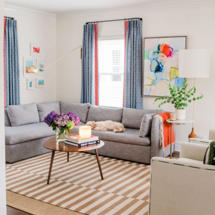
- “Bold colors make rooms feel smaller.” Nope! The right shade, placed thoughtfully, will actually create more depth and dimension.
- “You can’t mix multiple bold colors.” You can—it’s just about balance and contrast.
- “Bold color is only for accent walls.” Not true! Think doors, ceilings, cabinets, and trim.
- “Dark colors make a room feel heavy.” Deep hues can create coziness and sophistication when paired with the right lighting and furnishings.
- “Bright colors will overwhelm a space.” It’s all about placement! Any pop of color in the right application is game-changing… even in otherwise neutral surroundings.
How to Use Bold Interior Paint Colors with Confidence in 2025
So, you’re ready to break free from beige? Here’s how to do it without second-guessing yourself:
Start Small: Easy Ways to Introduce Bold Interior Paint Colors
Not ready to paint a whole room? Test the waters with a bold-hued interior door, a saturated color ceiling, or even your trim. Small steps, big impact.
How to Choose the Right Paint Color Family for Your Home
If picking just one color feels overwhelming, think in families. Deep greens, warm ochres, and rich blues can act as updated “neutrals” that bring life without overpowering.


Making Bold Color Feel Cohesive in Your Home
Bringing bold color into your home isn’t about throwing paint on the walls and hoping for the best—it’s about creating a thoughtful balance that makes your space feel both exciting and intentional. Here’s how to make it work:
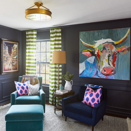
Let Contrast Tell a Story
Bold color is at its best when it’s anchored. Deep, moody walls come to life when paired with lighter furnishings, while brighter shades shine against rich wood tones or classic neutrals. It’s all about creating intentional contrast so colors feel curated rather than chaotic.
Layer Colors Like a Pro
Instead of stopping at just one bold shade, think about layering. If you’re using a vibrant green on the walls, consider pulling in a slightly deeper shade for the trim, or introducing a complementary color in upholstery and decor. This creates depth and keeps your space from feeling flat.
Use Color to Guide the Flow of a Space
In an open-concept home, color can serve as an invisible room divider. A rich, saturated hue in the dining area can add warmth and distinction without needing physical barriers, while a softer, complementary tone in the adjacent living space keeps everything feeling connected.
Find Your Color Confidence
If you’re struggling to pick the right bold shade, look at what already speaks to you. Your favorite outfit, a piece of artwork you love, or the colors you naturally gravitate toward on Pinterest—these are all clues to the hues that make you feel at home. Trust those instincts when selecting a color palette!


Your Shortcut to the Best Bold Interior Paint Colors for 2025
Choosing the perfect paint can feel overwhelming, but we’ve done the heavy lifting for you. Our Guide to the Best Interior Paint Colors for Your Home gives you:
✔ The best tried-and-tested paint colors (both classic bold and neutral!)
✔ Pro tips for making confident color choices – and the finishes that make them sing on each surface
✔ Distinct direction for every style—from subtle to statement
Let’s Talk: What’s Your Boldest Paint Choice?
Have you taken the leap into color, or are you still debating? Drop a comment below—I’d love to hear what paint colors you’ve been debating!

If you‘re looking for more tips for your home design projects, check out these posts:


https://shorturl.fm/euQfi